I am making good on my promise to discover new (to me) makeup companies. The latest victim is Makeup Geek.
Around 2014-2015, when I first got into beauty, Makeup Geek was the hottest brand around. Like the Too Faced Chocolate Bars and the Lorac Pro palettes, their eyeshadows exemplified the dominant eye makeup trends of that time. Peachy transition shades, 3+ matte browns for the crease (from lightest to darkest), shimmers or colorful shades for the lid. “Blend, blend, blend, and when you think you’ve blended ENOUGH, blend again.”
I remember reading all those posts where bloggers reviewed every single pan in their gigantic custom Makeup Geek palettes, and trying to imagine what my palette would look like. What were the classic shades? Peach Smoothie was the big one–you weren’t a true beauty guru if you didn’t swish it on to “blow out the crease” and “avoid harsh lines.” Another popular color was Bitten, a reddish matte (before those started popping up everywhere.) For some reason, I never got around to actually buying any Makeup Geek stuff, probably because I was curious to try so many shades that it was hard to make a decision (heh). And then other trends and brands came along–most importantly, ColourPop, which seems to have snatched a lot of spotlight from Makeup Geek.
But lately, the company has been in the news again, as part of a lineup of several brands newly available at Target. The selection, which also includes Coloured Raine, is meant to attract makeup fans with medium to dark skintones (and also me, because I use everything.) Sooooooo… I went on a long romantic walk to Tarjay.
Unfortunately, the only San Francisco store carrying Makeup Geek–the one on Geary–had a horrible display. There were no testers (for $20+ items? seriously) or at least displays where one could see what the colors look like in real life. The packaging for the Makeup Geek bronzers and highlighters was sealed. I guess, you were supposed to figure out which shade you want just by checking out swatches online?..
Fortunately, the eyeshadow palettes weren’t sealed, so I took a (careful!!) peek at the one called Dream. And I’m glad I did! Based on photos online, it seemed basic. “Doesn’t look like anything to me,” as the hapless robots in the first season of Westworld used to say. But the red shade, Anarchy, turned out to be more bright and shimmery than expected, and the highlighter, more complex. The palette went home with me, and after a week of constant use, I can honestly report that it’s awesome.
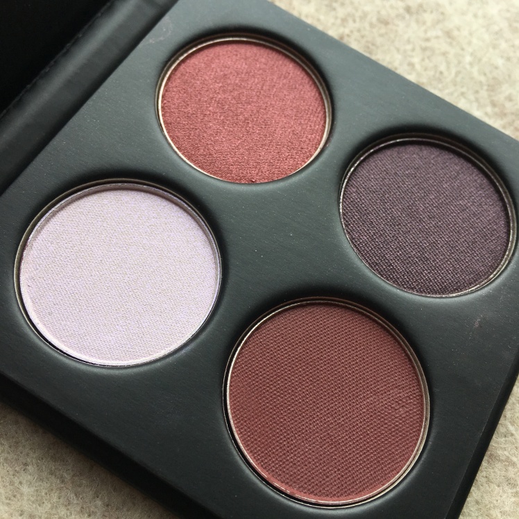
Seriously, I tend to be critical of stuff, but this little quad is solid according to all of the common criteria: saturation, longevity, and blendability. I can’t say that Dream is a product for “everyone,” though: the color scheme (reds and purples) is very bold.
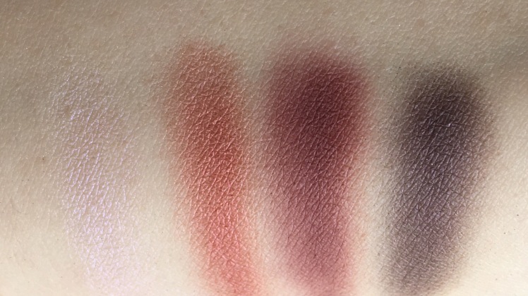
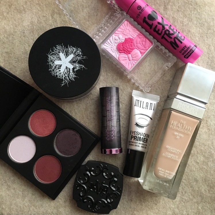
Swatches on top of the Milani eyeshadow primer. L-r: Phantom, Anarchy, Cherry Cola, Drama Queen.
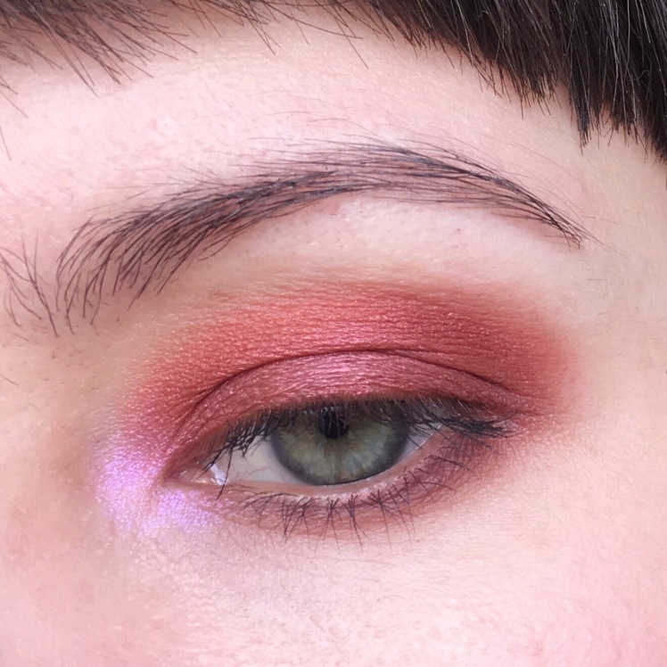
I didn’t really pay much attention to the violet/purple highlighter, Phantom at first. Yeah, pretty much all palettes have those light shiny shades that end up looking super subtle on the skin. Phantom, however, is in a league of its own. It turned out to be so vibrant and luminous, holy shit. (See the eye pic below for proof!) Would calling it a “fairytale” color sound corny? I don’t care, because this shadow is as fairytale as it gets.
Anarchy is a bright red metallic with hints of rust and pink. A very happy color. I think many brands are releasing shades like this now, as reds and metallics seem to be still on trend. (Elia Chaba wrote about a similar eyeshadow by a Russian brand recently.) Props to Makeup Geek for the idea to stick Anarchy and Phantom in one palette–the contrast between the two is striking, but nevertheless, this combo works! I’ve had a few people compliment my eye makeup when I was wearing those two together.
When I was creating my Makeup Geek wishlists back in the day, Cherry Cola always received top billing. As a green-eyed person, I get a ton of use out of reddish mattes. Cherry Cola is a nice outer corner/crease shade, or it can be worn by itself. Texture-wise, it reminds me of some mattes in the Urban Decay Heat palette, or ColourPop singles. It’s a slick-feeling and pigmented shade that (unfortunately) produces a bunch of fallout.
Drama Queen is one of those old-school Makeup Geek shades. A dirty dark purple with a subtle pink sheen. I basically grew up wearing such eyeshadows. Just swipe it all over, and watch it turn into a dark oily halo in a couple of hours. (Nowadays, such looks are considered high fashion.) I like Drama Queen patted onto the lid with my finger, with Cherry Cola blended into the crease.
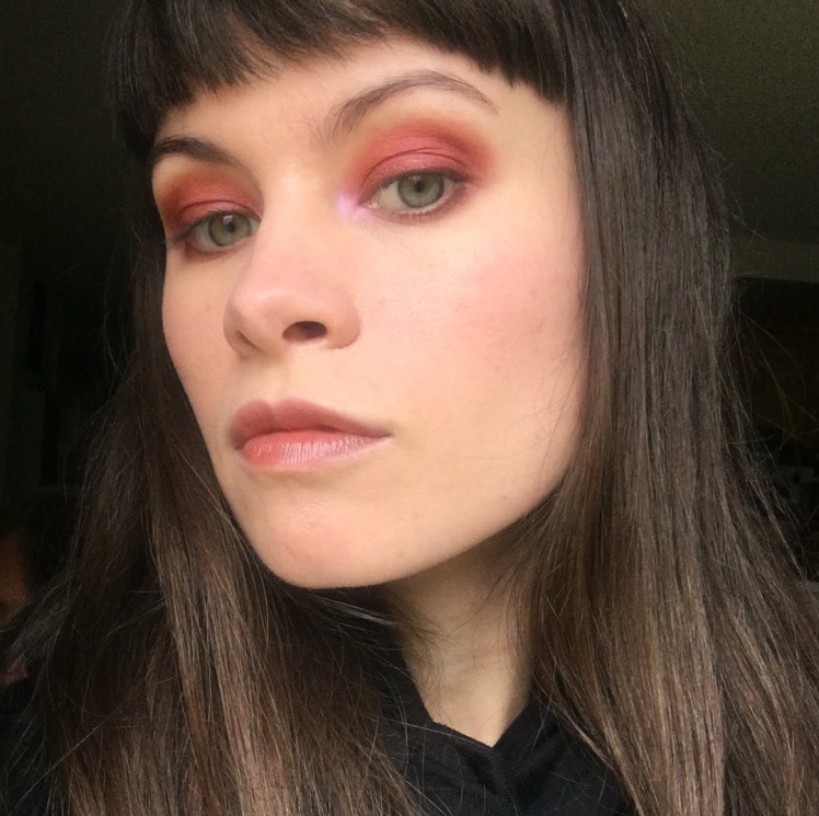
Here is the inevitable look with Anarchy on the lid, Cherry Cola in the outer corner, Phantom in the inner corner, and Cherry Cola & Drama Queen on the lower lashline.
And here is the full mug. I used two other “new to me” products for this look: the Physicians Formula Healthy Foundation and the Canmake Glow Fleur Cheek blush in the shade 08 Fuchsia Berry Fleur. The foundation’s great–it makes my skin look eerily perfect. A product for “statuesque glow,” a la Evan Rachel Wood in Westworld. However, I haven’t been able to make it a daily staple yet, as I can’t find a cruelty-free sunscreen that would work under liquid foundation (without any extra shine or pilling.) As for the Canmake blush, it’s a solid product for everyday office wear. A basic cool pink blush that stays pretty subtle even if you pile it on.
All the goodies. The lipstick, Urban Decay Lawbreaker, holds a special place in my heart. Such an amazing sheer chocolate shade. I wear it all the time!

I was curious about this quad. Thanks for the detailed reviews and a beautiful look!
LikeLike
Thank you Lena! Yes, it is a great great eyeshadow quad. I’ve been using it a lot!
LikeLike